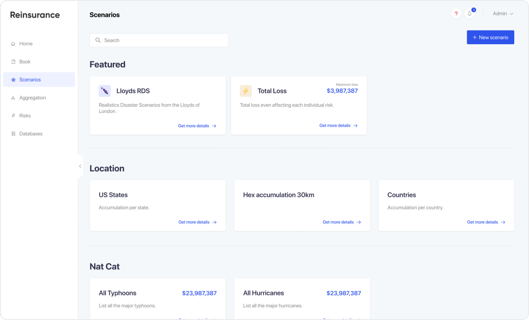
Reinsurance company
In other words, insurance of the insurance itself. The company name is under NDA.
Quick introduction
I worked as a contractor for this company from 2021 to 2022. The primary objective was to redesign the interface in a more consistent and user-friendly way.
During the process, I also designed new features and created a UI Kit for the developers to work more independently.
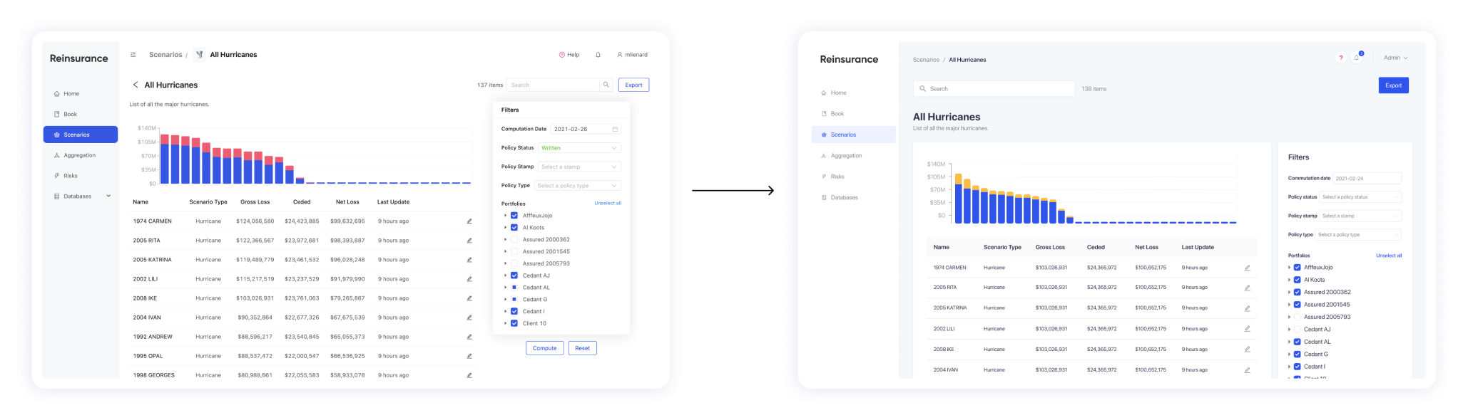
Redesign of the main pages
For the redesign, the idea was to make things simpler and more consistent across pages.
To execute this, I recreated a blue-ish color scale based on the branding and adapted to a product usage. The selected colors are also following an AA color contrast for accessibility matters.
The amount of data in the screens were massive, so I reworked the grid system to increase readability.
Last but not least, containers has been added to improve information architecture.
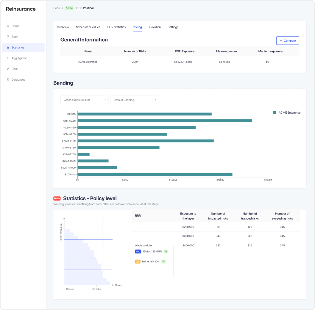
Schedule of values
A new complex page and a new feature to develop.
The request was to gather all information related to a portfolio on the very same page in some sort of advanced dashboard.
I have played with colors and different charts to break the different rhythms, increase readability and make it quicker to find the right information.
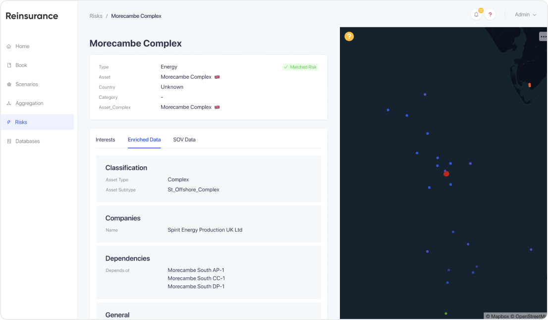
Risks
As the name explains it well, this page is related to the potential risks that could happen on a portfolio. Hypothesis could be based on natural catastrophes, financial systems, ... The calculations behind are relatively complex.
This feature was already existing, but it needed some additional information and a redesign.
My main objective with this screen was to properly separate information to make it easier to read and find.